How To Put Your Website Online – Using FTP & Web Host

In this video you’ll learn how to publish your website on the internet using an FTP program called FileZilla and your web host.
In this video you’ll learn how to publish your website on the internet using an FTP program called FileZilla and your web host.
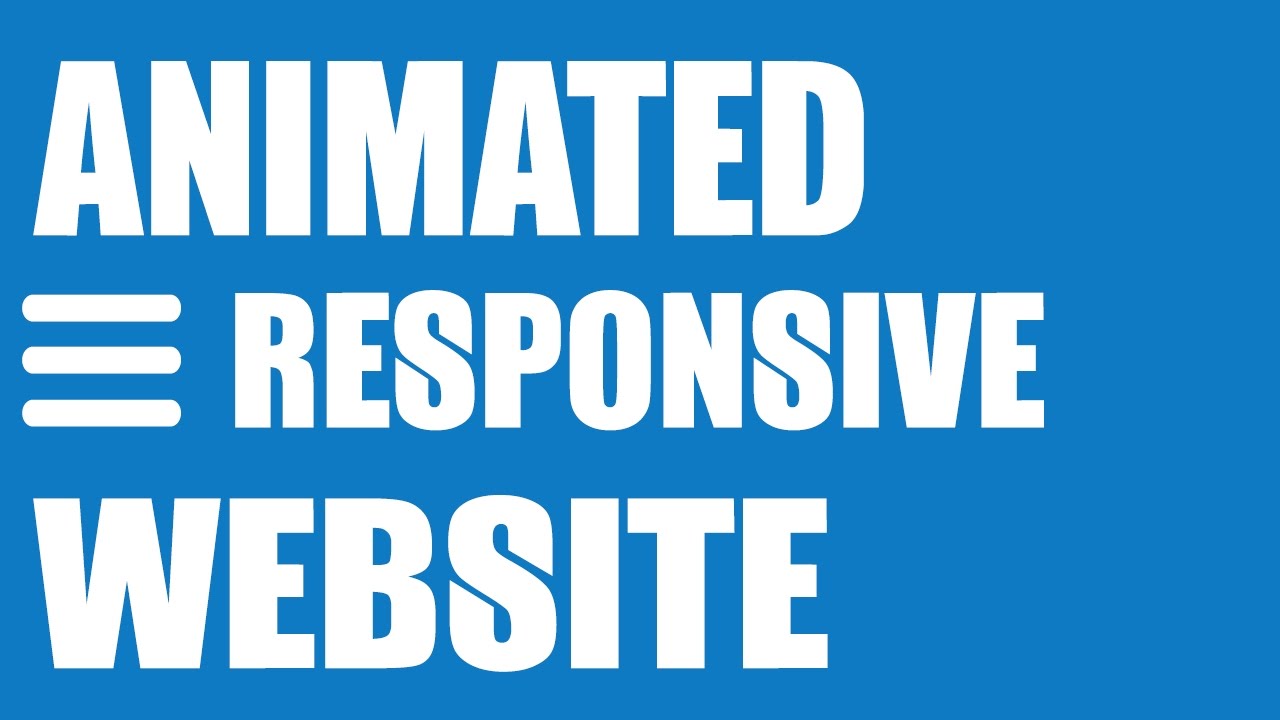
In this video we’ll learn how to design an animated responsive HTML5 and CSS3 website from scratch using only a text editor. The website design also features a navigation that will transform at the mobile or responsive width of the website.
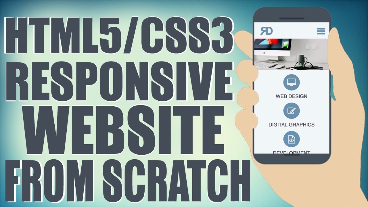
In this video we’ll learn how to design a responsive HTML5 and CSS3 website from scratch using only a text editor. The website design also features a navigation that will transform at the mobile or responsive width of the website.

In this video we’ll learn how to design a responsive HTML5 and CSS3 Photography website from scratch using only a text editor. The website design also features a navigation that will transform at the mobile or responsive width of the website as well as a full-screen landing page.
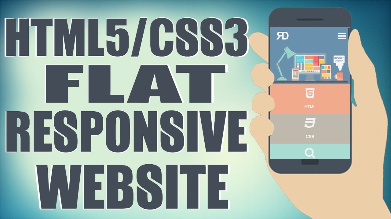
In this video we’ll learn how to design a responsive HTML5 and CSS3 website from scratch using only a text editor. The website design also features a navigation that will transform at the mobile or responsive width of the website.

In this video we’ll learn how to create an HTML5 and CSS3 responsive business website that’s mobile friendly. This responsive website design includes a jQuery drop down menu and image slider which is called the BX Slider.
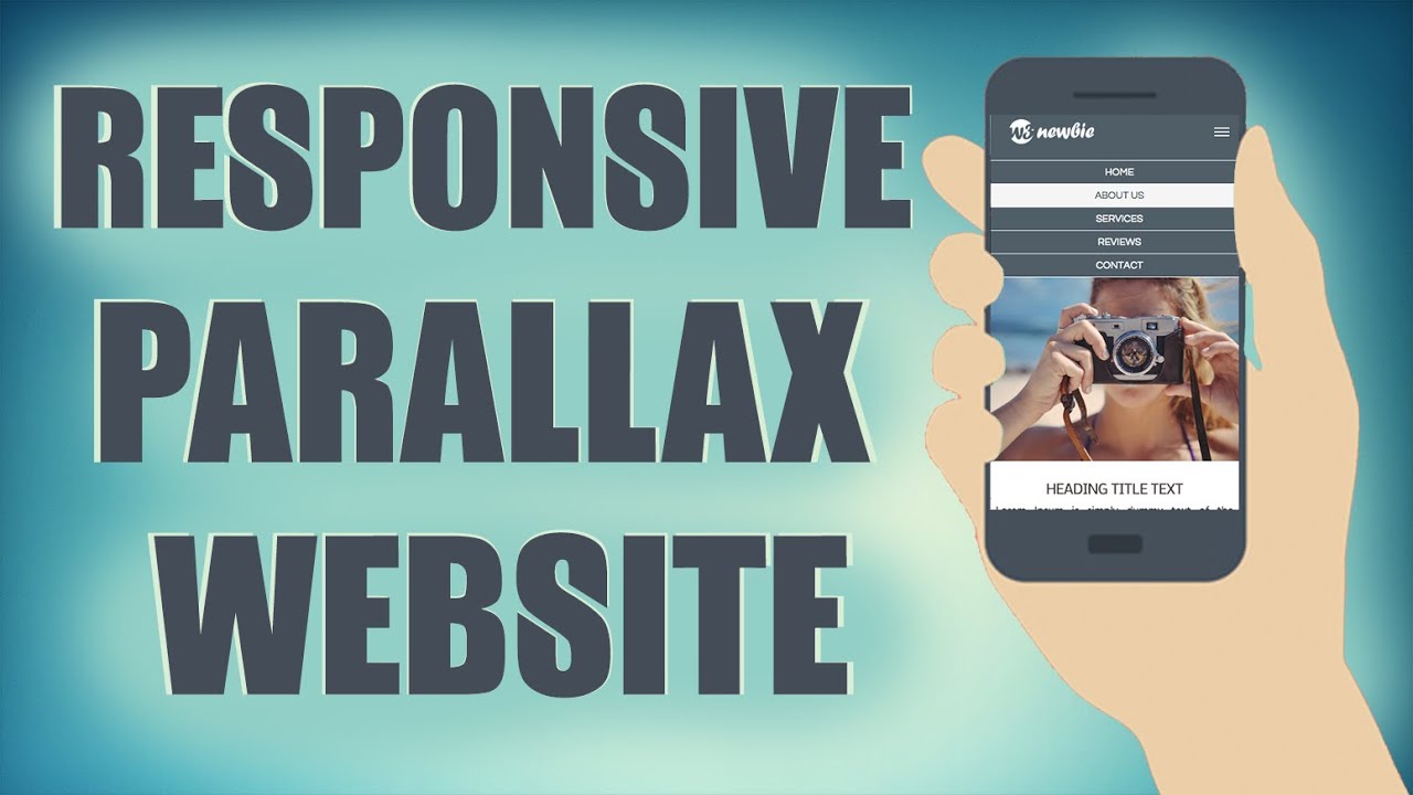
In this video we’ll learn how to design a responsive HTML and CSS parallax website from scratch using HTML5 and CSS3. The website design also features a jQuery image slider and navigation that will both transform at the mobile or responsive width of the website.
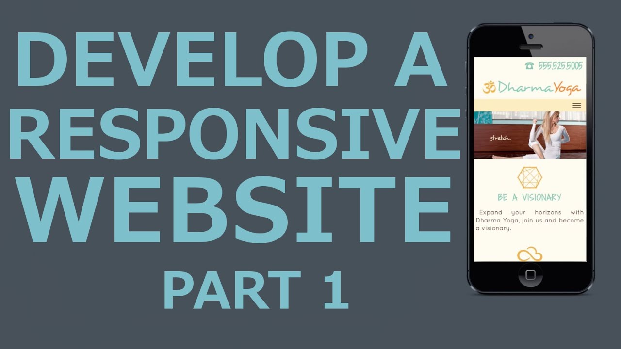
In this video we’ll develop an HTML5 and CSS3 responsive website called “Dharma Yoga” which also includes a jQuery Drop Down Menu and jQuery Image Slider.

In recent tutorials we created responsive websites with HTML5 and CSS3 using just a text editor (“Notepad ++” and/or “Text Wrangler”) yet we didn’t include any flashy elements such as an image slider or responsive drop down navigation. In this instructional tutorial, with the accompanying YouTube video, we’ll make a responsive website with an image slider, “The Blueberry Slider” by Mark Tyrrell, and a responsive drop down menu that will switch to an icon with the website’s responsiveness. Were also going to be using an icon set for images in our responsive website that are from the “Stylistica Icons Set” by Dry Icons but use whichever vector icons you like out of the set.
The CSS drop down menu has a single-column drop down effect when the website is 740 pixels or less in width, thanks to the media queries we’ll be adding towards the end of the tutorial. Enjoy!

In the video attached to this blog post you’ll learn how to make a simple responsive website with HTML5 and CSS3. For this template, we will have seven different sections running down the page as follows. When laying out the HTML for a responsive website, it’s important to plan out which aspects you’d like to be responsive so you can design for the smallest screen size using the “media queries” in your CSS. Three of our seven sections will not require media queries as the content will remain the same no matter the width.


 w3newbie.com
 w3newbie.com
 w3newbie.com
 w3newbie.com
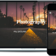 w3newbie.com
 w3newbie.com
 w3newbie.com
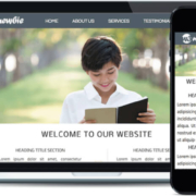 w3newbie.com
 w3newbie.com
 w3newbie.com
 w3newbie.com