Create A Bootstrap Theme From Scratch with Bootstrap 4, HTML5, & CSS3

In this video tutorial post we’ll create a Bootstrap 4 Theme using HTML5 & CSS3 from start to finish, with no steps skipped! Below you will find the complete YouTube video of the tutorial, the “Starter Files” with the necessary plugin files to build the Bootstrap Theme from scratch, and the text version of the tutorial with HTML and CSS explanations.
Please subscribe on YouTube 😊
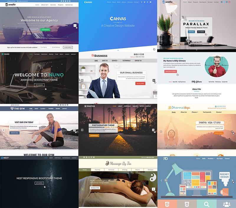
As mentioned in the video, the “Nest Bootstrap Theme” we’ll be building derives from one of the two complete Udemy Courses on building Bootstrap Themes I created which you can see using the link in the sidebar.
Bootstrap 4 is one of the most popular HTML, CSS, and JavaScript frameworks for developing responsive mobile-first website templates. This tutorial assumes you have beginner to intermediate HTML and CSS skills and while this isn’t exactly an “introduction” to Bootstrap, rather to show how to use Bootstrap to build a real world website, you don’t need any experience with the framework to jump in!
Tutorial outline:
- Tutorial Starter Files Download Overview
- Bootstrap Scrollspy & Navbar Navigation Menu
- Full Screen Landing Page
- Bootstrap Jumbotron and 3 Column Layout
- Two Column Image Portfolio Section
- Bootstrap Cards in the Testimonials Section
- Contact Us Footer Section
Tutorial Start Files Download Overview

The Nest Theme Starter Files consists of two main files, index.html & style.css, and one folder with all of the images included in it to complete the website design. I’m going to be using the free text editor called Sublime Text to build the theme, which works on Mac computers and PCs but you can use any text editor you want to build the website.
Once you open up index.html and style.css in your text editor you’ll see that there is some HTML & CSS included for us in their respective files. In index.html we have the basic mark-up of an HTML document already included for us with the DOCTYPE, html tag, head, and body sections:
<!DOCTYPE html>
<html lang="en">
<head>

</head>
<body>

</body>
</html>
At the beginning of the head section we have our character encoding tag (meta charset), the viewport set to the width of the device/screen with scale/zoom at 1 to be mobile friendly, and we have the title of our website set as “Nest Light – ResponsiveBootstrap 4 Theme” to appear in the browser tab. We’re also going to link to two CSS style sheet files in the head tag: style.css and an external file to link to bootstrap.min.css.
<meta charset="utf-8">
<meta name="viewport" content="width=device-width, initial-scale=1">
<title>Nest Light - Responsive Bootstrap 4 Theme</title>
<link rel="stylesheet" href="https://stackpath.bootstrapcdn.com/bootstrap/4.1.0/css/bootstrap.min.css">
<link rel="stylesheet" href="style.css">
Once we navigate down to the body section we’ll need to link to two JavaScript files in order to run the Bootstrap Framework: the latest version of jQuery and bootstrap.min.js.
You can find the latest version of the Bootstrap CSS file and the Bootstrap JavaScript file here: https://getbootstrap.com/docs/4.1/getting-started/introduction/
<!--- Script Source Files -->
<script src="https://code.jquery.com/jquery-3.3.1.slim.min.js"></script>
<script src="https://stackpath.bootstrapcdn.com/bootstrap/4.1.0/js/bootstrap.min.js"></script>
Now that we’ve covered what’s included for us already with the starter files in the HTML file, let’s get an overview of the style.css file. At the top of the document you’ll see the text “right gutter fix” along with “overflow-x: hidden;” to prevent content from overflowing outside of the body and fix a Bootstrap “gutter” issue where there is 15 pixels of white space on the right side of the page due to inherent Bootstrap margin to row classes which we’ll cover later.
body {
     overflow-x: hidden; /--right gutter fix--/
     font-family: sans-serif;
     color: #505962;
 }
Also in style.css we have the “iOS Landing Page” CSS, which will make it so the fixed background image landing page display properly on iPhones because without this the background image will not display fixed. We’ll reference these classes again when laying out the HTML.
/*--- iOS Landing Page Fix --*/
.landing {
  position: relative;
  width: 100%;
  height: 100vh;
  display: table;
  background: #E9ECEF;
  z-index: -1;
}
.home-wrap {
  clip: rect(0, auto, auto, 0);
  position: absolute;
  top: 0;
  left: 0;
  width: 100%;
  height: 100%;
}
.home-inner {
  position: fixed;
  display: table;
  top: 0;
  left: 0;
  width: 100%;
  height: 100%;
  background-size: cover;
  background-position: center center;
  -webkit-transform: translateZ(0);
          transform: translateZ(0);
  will-change: transform;
}
Bootstrap Scrollspy & Navbar Menu
Bootstrap Scrollspy allows us to “spy” on a section of our website by linking it to our navigation menu where it will highlight nav links per section of the website we’re scrolling through in our browser. We’ll set Scrollspy up inside of the opening body tag as seen in the HTML below. Later, when building the navigation, we’ll reference the data target name given below which is in reference to the div id that will be used for the menu, hence the “#” hash at the beginning for an id.
<body data-spy="scroll" data-target="#menu">
</body>
To link sections of our website to the menu, so it knows what to highlight when we scroll a certain section of the page, we’ll need to set a div id that will be linked to using the navigation. For example, if you have <div id=”home”> as the id wrapping around content for one section of the page, the nav link will be <a href=”#home”> and Bootstrap Scrollspy will highlight that menu link when scrolling through the id.
<!--- Start Home Section -->
<div id="home">
</div> <!--- End Home Section -->
Now that we have Scrollspy set up, let’s start the Navbar menu which will be inside of the “home” section of the website. The “home” id will link to the navbar, as will the rest of the div id sections for the rest of the website. Starting off the nav, we’ll need to specify the styling of it. We’ll do this with “navbar-dark” to make our menu links match a dark background color with light colored links. We’ll also use the “bg-dark” class to set the background color to Bootstraps dark menu color, set the “navbar-expand-md” class to have the menu expand to the desktop width from the mobile with at the medium (768px) width, and add the “fixed-top” class to keep the navbar fixed at the top of the page as we scroll down the page.
<!--- Navigation -->
<nav class="navbar navbar-dark bg-dark navbar-expand-md fixed-top">
</nav>
In order to get the navigation to span 100% of the browser window no matter the screen width, we’re going to add a “container-fluid” class from the Bootstrap library. Now we’ll start to see the first of our content displaying in the web browser with the thin navbar before adding the links and logo.
<div class="container-fluid">
</div>
With our div closed for the container-fluid class tag we can start adding our actual navbar content starting with the logo for our website. To add our logo we’re going to wrap it with an anchor tag so the logo image acts as a link to bring us back to the home page of the website or wherever you’d like to send website visitors. Once we add the “a” tag we’ll give it the “navbar-brand” class, which is designated for images/logos in the Bootstrap navbar. Inside of the anchor tag will be the link to our logo image from the starter files, “img/nest.png”, which can be found in the “img” folder.
<a class="navbar-brand" href="#"><img src="img/nest.png"></a>After adding the “Nest” logo with the navbar-brand class we’ll find that the logo looks rather large for the navbar. So what we’ll do is add some CSS to the style.css file that will size down the logo, but first let’s make the menu links uppercase once they are added with the “navbar” class used in reference below and give it a custom background color.
.navbar {
	text-transform: uppercase;
	background-color: #505962;
}
As for the size of the logo, let’s give is a height of 2rem. Rem, instead of pixels or percentage values, is the default metric with Bootstrap. If you’re unfamiliar with “rem” as a sizing metric, one rem is equal to sixteen pixels because that is the default font size of Google Chrome, so this is the equivalent to 32 pixels in height. Also make note that to make the logo image appear crisp and clear on high resolution phones we have the size of the source image set to twice the height/size it will display at, which is 64 px in height or 4rem.
.navbar-brand img {
	height: 2rem;
}
Now that we have our logo fit to an appropriate height for the navbar, let’s add the drop-down button that will open the responsive menu on small screens. The nav menu will be nested inside of the drop down button we create and the button will only display on screen widths narrower than 768px. We’ll use the HTML button tag and give it a class called “navbar-toggler”, which is the default drop down class with Bootstrap. Then we’ll add “type ‘button and data – toggle collapse” because we want our menu to open and collapse when we click on the button. Next we’ll add the “data – target” and this will be the ID that we’ll give our nav menu so the button knows what to toggle. Let’s make the id, which we can call whatever we want, ”menu.” Then lastly, with regards to the toggle button, we’ll add the bars inside of it to make it a hamburger icon using the Bootstrap class “navbar-toggler-icon” inside of the span tag.
<button class="navbar-toggler" type="button" data-toggle="collapse" data-target="#menu">
	<span class="navbar-toggler-icon"></span>
</button>
Next lets add the actual content that will be opening and collapsing using the menu button. We’ll first need to wrap the list that will contain our navigation with a div that will cave the “collapse” and “navbar-collapse” Bootstrap tags. Then we’ll need reference the id that we added to the buttons data-target, “menu”, as referenced earlier.
<div class="collapse navbar-collapse" id="menu">
</div>
We have reached the unordered list. This is where our list-items will contain the navigation links for our Bootstrap website. First we’ll add the “ul” tag for our unordered list. We’ll need to give it the “navbar-nav” class, which is standard for Bootstrap navigations. Next we’ll need to specify the positioning of where we want the menu links to display in the navbar where we’ll use the “ml-auto” class, or margin-left: auto; to position the links on the right rather than using “mr-auto” where the links will be to the left and “mx-auto” centering links.
<ul class="navbar-nav ml-auto">
</ul>
Inside of our unordered list we’ll have our first list item and each one of our list items will have the same class called “nav-item”. Now we can add the first of our navigation links using anchor tags with a class called “nav-link”. As mentioned earlier in this post, we’ll be linking to different sections of the page by referencing the id’s we give them using Bootstrap Scrollspy. For our first link we’ll be sending website visitors to the very top of the page where the navbar is, which is contained in the id called “home”. So the link will be <a href=”#home”> and then inside of the open and closing anchor tags we can add the actual link text which is “Home” in this case.
<li class="nav-item">
	<a class="nav-link" href="#home">Home</a>
</li>
Now that the first link has been added, we can repeat the process for the rest of our links using their relative ids they’ll be linking to further down the page, which will be added later as we continue to build the Bootstrap Theme.
<li class="nav-item">
	<a class="nav-link" href="#about">About</a>
</li>
<li class="nav-item">
	<a class="nav-link" href="#portfolio">Portfolio</a>
</li>
<li class="nav-item">
	<a class="nav-link" href="#testimonials">Testimonials</a>
</li>
<li class="nav-item">
	<a class="nav-link" href="#contact">Contact</a>
</li>
Full Screen Landing Page
Earlier in this post the “iOS Landing Page Fix” included in the style.css file of the starter files was referenced. This CSS takes care of most of the styling for the fixed, full screen landing page, other than adding the actual background image. We’ll use three different divs to display the full screen image which will allow it to work seamlessly across mobile phones/tablets with fixed positioning.
<!--- Start Landing Page -->
<div class="landing">
	<div class="home-wrap">
		<div class="home-inner">
		</div>
	</div>
</div>
Now for the CSS portion of the full screen landing page image, we’ll reference the inner most div class called “home-inner” and apply the background image from the starter files download:
.home-inner {
	background-image: url('img/landing.png');
}
Next let’s add the content that displays on top of the background image. CSS will allow us to position this content on top of the image without the HTML being inside of the divs for the background image. We’re going to use a non-bootstrap div class that we’ll use to position the content called “caption” followed by the “center-block” class, adding a block display along with auto horizontal margin to center the div, and the “text-center” class to center align our inner content.
<!--- Start Landing Page Caption -->
<div class="caption center-block text-center">
</div>
Once we have the HTML added for the landing page we can move onto the CSS for the non-bootstrap class we’re using called “caption” that the landing page content will be nested in. We’ll need the caption class to span 100% of the screen and have a max-width of 100% so on mobile devices with heading we’re going to add will contained in the browser window. To get the content to sit on top of the landing page we’ll use absolute positioning so we can place it where we want (40% from the top of the window), give it a positive z-index to make sure it sits on top of the image, and have it scroll with the window as the image stays fixed.
.caption {
	width: 100%;
	max-width: 100%;
	position: absolute;
	top: 40%;
	z-index: 1;
}
Inside of the caption div, the content we’ll add over top of the background image will start with a heading 3, then underneath that will be our button that will link users down to the next section of the page using its id with Bootstrap scrollspy. To display the Bootstrap button, start with an anchor tag so we can give it the appropriate classes from Bootstrap to display the button. All Bootstrap buttons will start with the “btn” class followed by a class specifying the style of the button from the Bootstrap Documentation/Components. In this case we’ll use the “btn-outline-light” class, specifying a border with “outline”, rather than a background color, and the “light” portion of the class is for the white border as opposed to “btn-outline-dark” for example with a dark gray shade.
<h3>Nest Responsive Bootstrap Theme</h3>
<a class="btn btn-outline-light" href="#about">Get Started</a>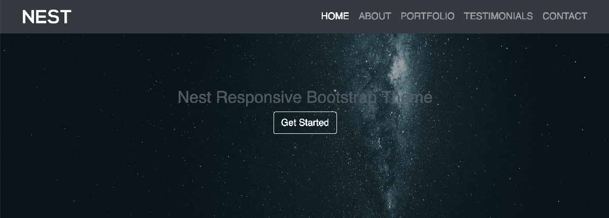
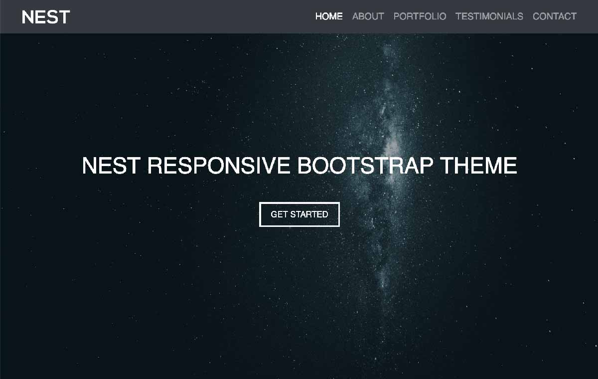
As for the styling of the heading 3, since we’re using a dark background image we’ll make the color of the text white to make it stand out and we’ll make the heading font size 2.4rem, or about 38px. Then keeping with the uppercase characters in the menu, let’s do the same with the heading and add some padding to the bottom of it to create some separation between it and the Bootstrap button.
.caption h3 {
	color: white;
	font-size: 2.4rem;
	text-transform: uppercase;
	padding-bottom: 2rem;
}
The Bootstrap framework has already taken care of adding white text and a border to match using the “btn-outline-light” class but lets add some additional styling to the button. Since we only have one button in the website design, we can simply reference the “btn” class instead of selecting both classes in the link for the button or creating a new class for styling. Bootstrap buttons inherently come with a thin border and some border radius. Let’s give it a thicker border width using “medium” and remove the border radius to make the corners square by adding “0”. Then we’ll make the text uppercase, reduce the font size slightly, then lastly add some additional horizontal & vertical padding between the button text and the border.
.btn {
	border-width: medium;
	border-radius: 0;
	text-transform: uppercase;
	padding: .5rem 1.1rem;
	font-size: .9rem;
}
Bootstrap Jumbotron and 3 Column Layout
You might have noticed from looking at the website layout that the section underneath the landing page image has a darker shade to its background color than the rest of the website. This is called the Bootstrap Jumbotron. Jumbotron is a Bootstrap class that applies the aforementioned light gray background color as well as additional all around padding to highlight content on your website.
Before we move on to the Jumbotron, let’s lay out the div id that will wrap around it for the About Section of the website so Bootstrap scrollspy knows to light up the navigation menu for that particular section.
<!--- Start About Section -->
<div id="about">
</div> <!---End About Section -->
Now we can add the Jumbotron section using the “jumbotron” class that we’ll add our content inside of it starting with a heading 3 for the “About section” and add a class called “heading” to give it custom styling.
<div class="jumbotron">
	<h3 class="heading">About</h3>
</div> <!--- End Jumbotron -->
As for the styling to the heading 3, which will be used for multiple sections of the website, let’s align the text in the center of the page, increase the font size, make the characters uppercase, and add some margin to the bottom of if for added space before the three columns start.
h3.heading {
	text-align: center;
	font-size: 1.9rem;
	text-transform: uppercase;
	margin-bottom: 1.9rem;
}
Underneath the About title will be the three columns section of the website where we’ll first take advantage of the fantastic Bootstrap Grid System that will take care of the styling and responsiveness of the columns.
Before we can add the columns we’ll need to wrap them with a row. Rows will always have columns nested within them and typically we’ll want to have our rows inside of a container or container-fluid class but in this case we’ll skip it because of the padding the jumbotron gives us. Here is the HTML for the row:
<div class="row">
</div> <!--- End Row -->
As for the columns, there are twelve columns total with Bootstraps Grid System and we can slice them in any combination we want as well as apply break points so the columns shift at different widths. Each column class with start with “col-“ then we define the width at which we want the mobile version of the website to transition from a single width column to the number of columns (three here) that we specify. In this case we’re using the medium (md) screen with breakpoint with Bootstrap grid, which will apply the columns we set on screen sizes at 768px in width and above so now we’re up to “col-md-“ for the class. Lastly, with three columns we’ll just divide 3 into the 12 available columns so now our class is “col-md-4”. Then we’ll also add the “text-center” to center the heading 4 and paragraph text in each column as seen below where all of the following HTML will be included inside of the row to conclude the about section.
<div class="col-md-4 text-center">
	<h4>Full Screen Landing</h4>
	<p>Nest features a full screen, responsive landing page using Bootstrap.</p>
</div>
<div class="col-md-4 text-center">
	<h4>Smooth Scrolling</h4>
	<p>The Nest Bootstrap navigation menu features smooth scrolling links.</p>
</div>
<div class="col-md-4 text-center">
	<h4>Contact Form</h4>
	<p>Using Bootstrap and PHP Mailer, Nest has a responsive contact form.</p>
</div>
Two Column Image Portfolio Section
The portfolio section of our Bootstrap website will be similar to the About section in that we’ll wrap it with a div id for the purposes of linking to the section with the navigation and taking advantage of Bootstrap Scrollspy so the menu highlights the section we’re navigating. In this section’s case though we’re going to add a container-fluid class so the portfolio spans the entire width of the screen and we’ll also add a non-bootstrap class called “padding” which we’ll use to adjust the websites padding in the CSS. Then inside of the portfolio id and container-fluid we’ll add the heading 3, also similar to the About section, followed by a row underneath it to next our columns. You’ll notice below the class called “no-padding” added to the row div and this is because rows inherently add padding, which we’ll remove using CSS so the portfolio takes up 100% of the screen width.
<!--- Start Portfolio Section -->
<div id="portfolio">
<div class="padding">

	<h3 class="heading">Portfolio</h3>

<div class="row no-padding">

</div> <!--- End Row -->
</div> <!--- End Container Fluid -->
</div> <!--- End Portfolio Section -->
For the padding class added above, we’ll add vertical padding to the top and bottom of 2rem an no padding on the left or right.
.padding {
	padding: 2rem 0;
}
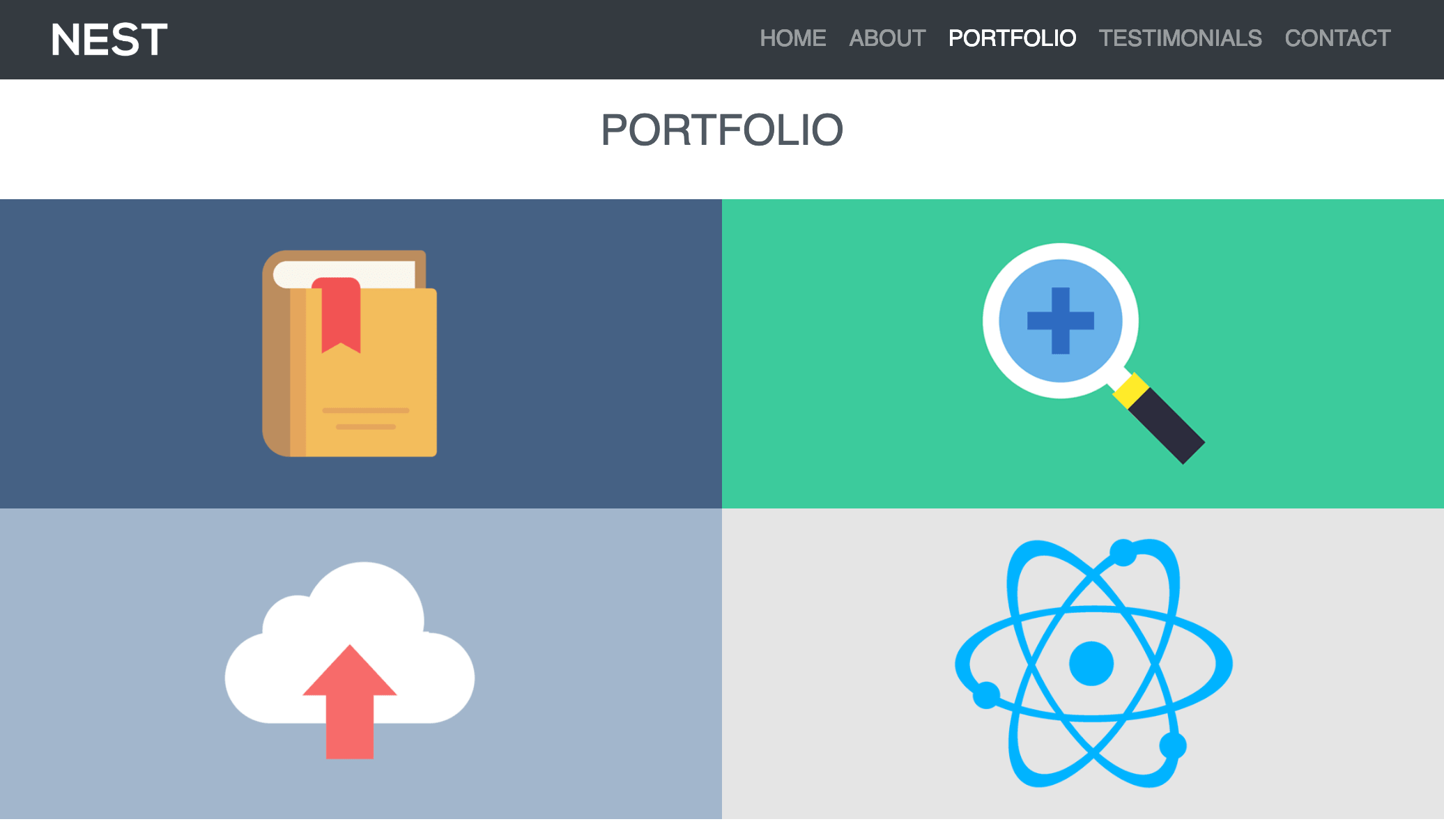
In the About section we learned about the Bootstrap Grid System and what class to use to create the three column layout using “col-md-4” where the break point was a 768px. With the Portfolio section of the website we’ll use a similar structure but since it is a two column layout we’ll divide two into the twelve column grid to come up with “col-md-6” as the two column class with the 768px medium screen width break point. Later in the CSS we’ll style the non-bootstrap “portfolio” class added that have been given to the four portfolio images from the starter files.
<div class="col-md-6">
	<img class="portfolio" src="img/1.png">
</div>
<div class="col-md-6">
	<img class="portfolio" src="img/2.png">
</div>
<div class="col-md-6">
	<img class="portfolio" src="img/3.png">
</div>
<div class="col-md-6">
	<img class="portfolio" src="img/4.png">
</div>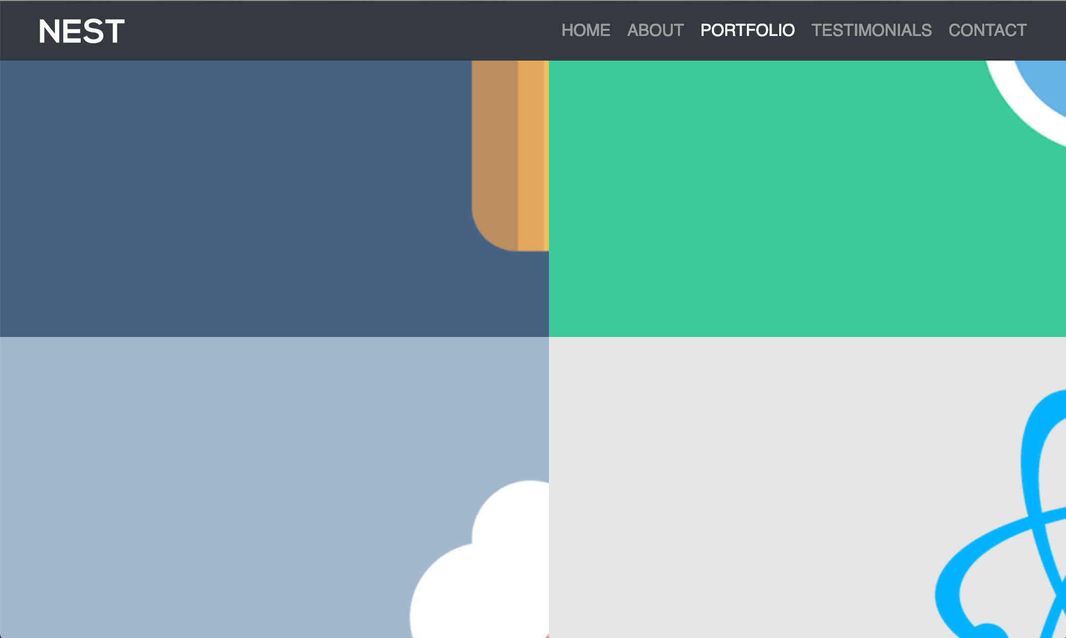
Now what we’ll need to do is make sure the images do not span outside of the column it is inside of or the browser window on smaller screens by applying “max-width: 100%;” to the portfolio class. This way we’ll be able to see the whole image in each one’s respective column. If your images are small you can also add “min-width: 100%;” to make sure the images span the full column width. Then, as seen below, we’ll also take the inherent padding away from the columns using the “no-padding” class we added.
img.portfolio {
	max-width: 100%;
        min-width: 100%;
}
.no-padding .col-md-6 {
	padding: 0;
}
Bootstrap Cards in the Testimonials Section
The Testimonials section will start off similar to the About & Portfolio sections with a div id wrapping around it for Bootstrap Scrollspy as well as a heading 3 for the section’s title.
<!--- Start Testimonials Section -->
<div id="testimonials">

	<h3 class="heading">Testimonials</h3>

</div> <!--- End Testimonials Section -->
Also similar to above we’ll add a row here to have our columns inside of, as seen with the HTML below and we’ll reference the padding class we used previously.
<div class="row padding">
</div> <!--- End Row -->
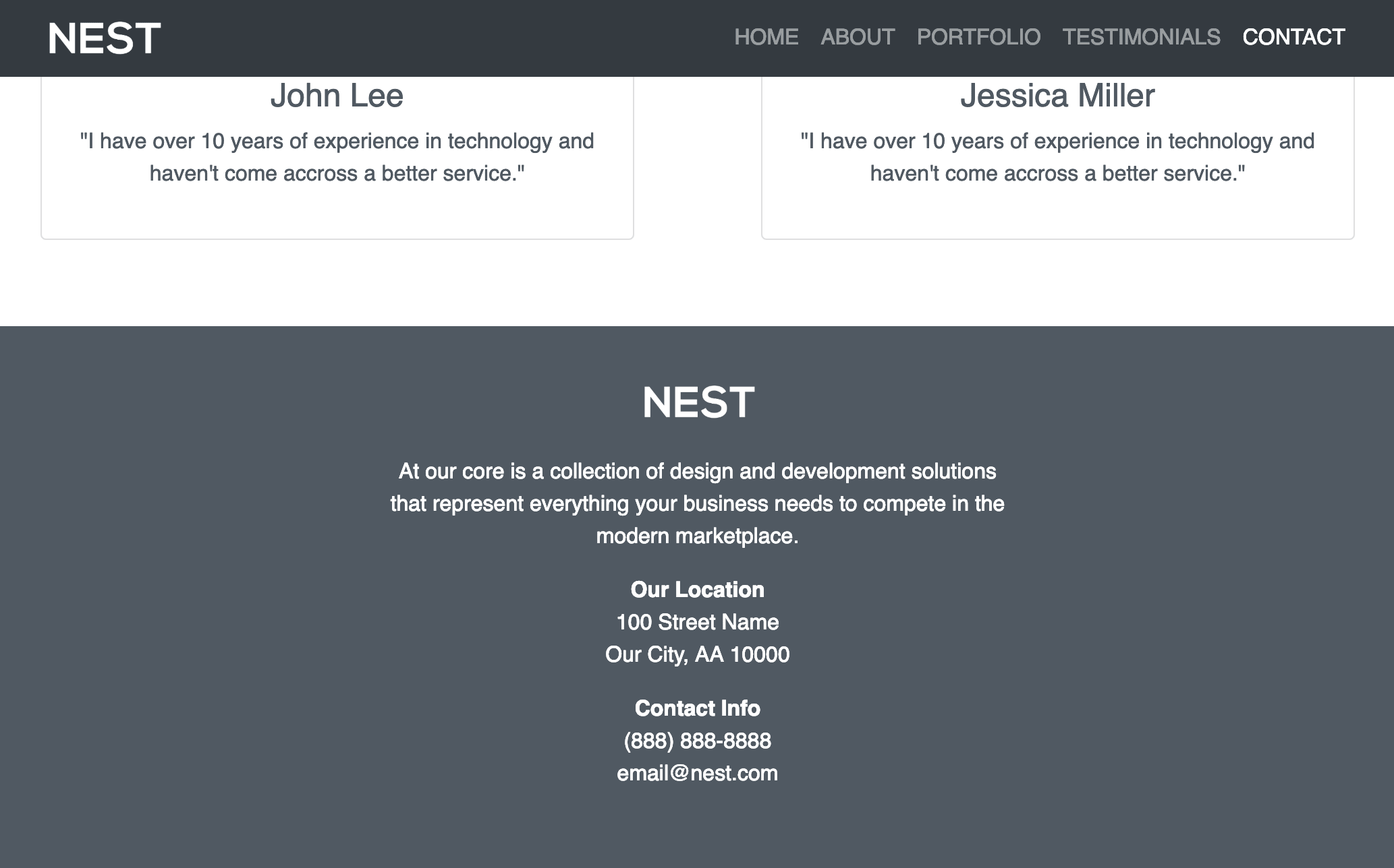
Then similar to the portfolio section we’re going to use two columns to display our content with the “col-md-6” class. Inside of our columns we’ll use a feature from the Bootstrap library called “cards” to display the testimonials including an image, title, and paragraph.
A Bootstrap card is a content box component with padding inside of the element. Inside of cards there are a number display options such as headers, titles, images, paragraphs, and footers. For our testimonial cards inside of the “col-md-6” class, we’ll use the ‘card’ class along with the ‘text-center’ class to center the heading and paragraph we’ll add. Then inside of the card class we’ll use the ‘card-img-top’ class along with the image source to place our image at the top of the card, followed by the ‘card-body’ class to display a heading 4 and paragraph about the testimonial. Here is the HTML for the two testimonial columns:
<div class="col-md-6">
	<div class="card text-center">
		<img class="card-img-top" src="img/5.png">
		<div class="card-body">
			<h4>John Lee</h4>
			<p>"I have over 10 years of experience in technology and haven't come accross a better service."</p>
		</div>
	</div>
</div>
<div class="col-md-6">
	<div class="card text-center">
		<img class="card-img-top" src="img/6.png">
		<div class="card-body">
			<h4>Jessica Miller</h4>
			<p>"I have over 10 years of experience in technology and haven't come accross a better service."</p>
		</div>
	</div>
</div>
Now that we have our columns added, let’s adjust the margin around the Bootstrap cards so they don’t take up as much of the columns space:
.card {
	margin: 2rem;
}
Contact Us Footer Section
Now let’s move on to the Contact section of the website, which will also act as the footer. Similar to the above sections, we’ll start it with a div id wrapping around it for Bootstrap Scrollspy. Then inside of the div id we’ll add a ‘container-fluid’ class and a non-bootstrap class we’ll call ‘footer’, which will be used in reference for styling. Underneath the container-fluid class we’ll also add a div class row to next the columns.
<!--- Start Contact Section -->
<div id="contact">

<div class="container-fluid footer">
<div class="row">

</div> <!--- End Row -->
</div> <!--- End Container Fluid Footer -->
</div> <!--- End Contact Section -->
To distinguish the footer from the rest of the website, let’s give the footer a background color similar to the shade of the text by referencing the footer class and row. We’ll also add 1rem of padding to the top, 2rem to the left & right for mobile, and 3 rem on the bottom of the footer as well as make the test white.
.footer .row {
	background-color: #505962;
	padding: 1rem 2rem 3rem;
	color: white;
}
The contact section of the website will use another ‘col-md-6’ class, taking up half of the 12 available Bootstrap columns, and we’ll center the column on screens wider than 768px. The right method to center the column, which I realized after making the video tutorial, would be add a class called ‘justify-content-md-center’ aside the ‘row’ class in its respective div. Instead, the method of using a blank ‘col-md-3’ class before ‘col-md-6’ took up 25% of the space to center the content and underneath 768px the one-fourth column would not take up any space at all with the single-column mobile layout of the website.
<div class="col-md-3"></div>
<div class="col-md-6 text-center">

</div>
Now once we’ve added the “col-md-6” class we can add the footer content where we’ll add the logo image and paragraph tags to display the contact information along with ‘strong’ HTML tags to make certain text bold.
<img src="img/nest.png">
<p>At our core is a collection of design and development solutions that represent everything your business needs to compete in the modern marketplace.</p>
<strong>Our Location</strong>
<p>100 Street Name<br>Our City, AA 10000</p>
<strong>Contact Info</strong>
<p>(888) 888-8888<br>[email protected]</p>
The last bit of CSS that we’ll add will be to make the height of the logo in the footer match the height in the navbar with 2rem and add some margin to the top and bottom of the image.
.footer img {
	height: 2rem;
	margin: 1.5rem 0;
}
That wraps up the tutorial on how to create a Bootstrap Theme! Please check out my Bootstrap Courses on Udemy and I’ll see you inside!


 w3newbie.com