CSS Media Queries
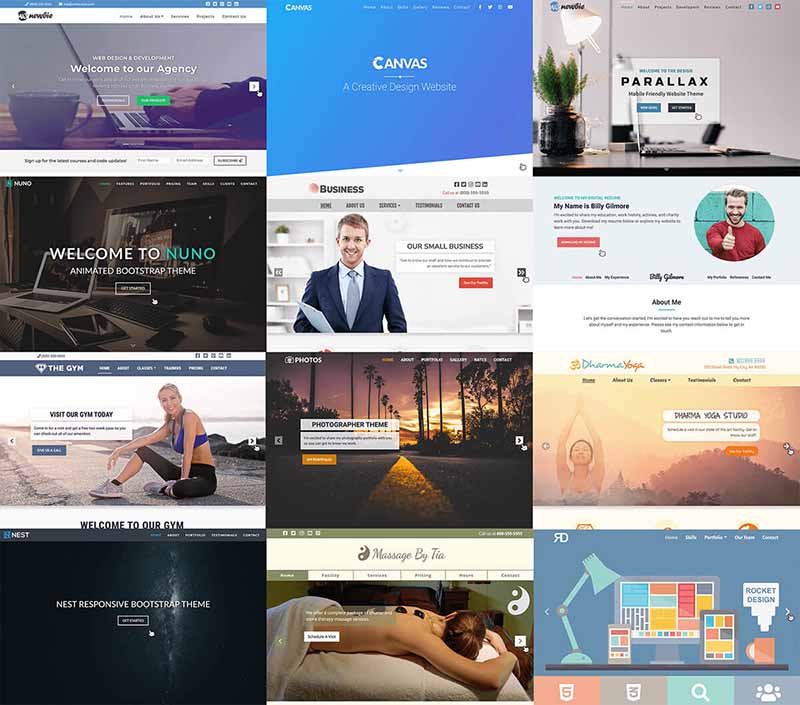
CSS media queries allow you to adapt the presentation of your web content to different screen sizes, device types, and user preferences, ensuring an optimal viewing experience across a wide range of devices.
Here’s how CSS media queries work:
1. Basic Structure:
- Media queries are embedded within CSS using the
@mediarule, followed by a set of conditions within parentheses. - These conditions evaluate specific media features, such as screen width, device orientation, resolution, and more.
- If the conditions are met, the CSS rules within the media query block are applied, overriding any default styles.
2. Common Media Features:
- width: Targets screen width (e.g.,
@media (max-width: 768px)) - height: Targets screen height (e.g.,
@media (min-height: 480px)) - orientation: Detects device orientation (portrait or landscape)
- resolution: Determines screen resolution
- color: Checks for color capabilities
3. CSS Media Queries Examples:
CSS:
/* Styles for small screens (e.g., smartphones) */
@media (max-width: 576px) {
  body {
    font-size: 14px;
  }
  img {
    width: 100%;
  }
}

/* Styles for medium screens (e.g., tablets) */
@media (min-width: 768px) and (max-width: 992px) {
  .sidebar {
    display: none; /* Hide the sidebar */
  }
}
4. Responsive Design:
- Media queries are essential for building responsive websites that adapt seamlessly to different devices.
- You can create multiple media queries to target various viewport sizes and device characteristics.
5. Additional Considerations:
- Logic Operators: Use
and,not, andorto combine multiple media features within a single query. - Media Types: Specify different media types (e.g., print, screen, handheld) for context-specific styling.
- Browser Support: Media queries are widely supported across modern browsers, ensuring compatibility.
Best Practices:
- Use media queries strategically to enhance user experience, not just for visual adjustments.
- Test your website’s responsiveness across various devices and browsers.
- Consider accessibility and ensure content is accessible regardless of screen size or device type.
Key Points:
- Media queries use the
@mediarule to apply styles based on screen characteristics. - Common media features include
width,height,orientation, andresolution. - Use logical operators like
and,not, andonlyto combine multiple features. - Media queries are essential for responsive web design, ensuring optimal viewing experiences across different devices.


 w3newbie.com
 w3newbie.com