CSS Responsive Web Design
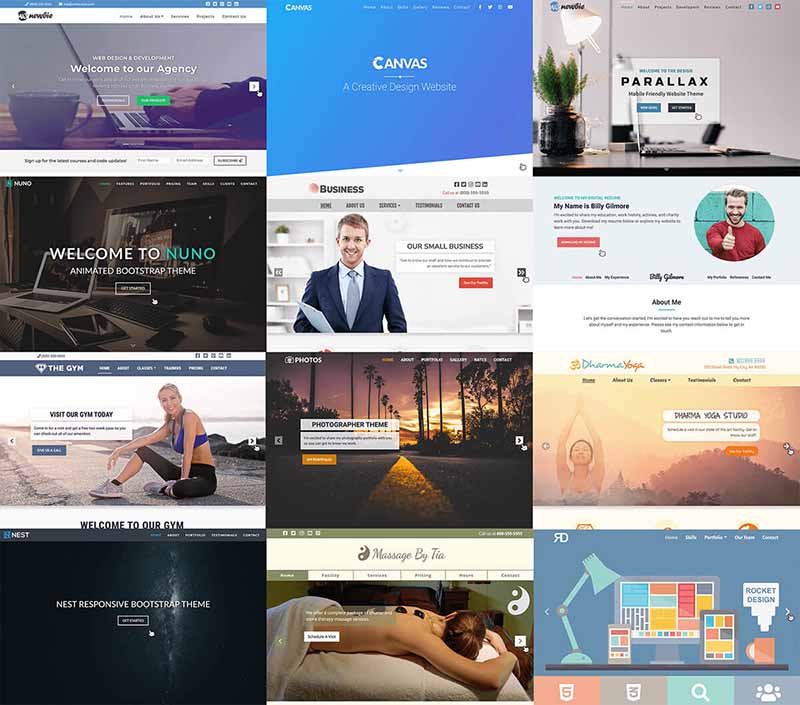
CSS responsive web design refers to the ability of a website to adapt its layout and appearance to different screen sizes and devices, ensuring optimal viewing experiences across a wide range of devices, from desktop computers to smartphones and tablets.
Key Principles of CSS Responsive Web Design (RWD):
- Fluid Layouts:
- Use flexible units like percentages (%) or viewport units (vw, vh) instead of fixed pixel values for widths and heights. This allows elements to scale proportionally with the screen size.
- Media Queries:
- Apply CSS rules conditionally based on screen size or device features using media queries. This enables you to create distinct styles for different viewports.
- Flexible Images:
- Employ techniques like
max-width: 100%;or thesrcsetattribute to ensure images scale appropriately for different screen sizes.
- Employ techniques like
- Responsive Typography:
- Use relative units like em or rem for font sizes, and consider adjusting line heights and spacing for better readability on smaller screens.
- Mobile-First Approach:
- Design for smaller screens first and then adapt for larger screens, promoting a content-focused and streamlined experience.
Common Responsive Web Design Techniques:
- Flexbox: A flexible layout model that excels at arranging elements in one-dimensional rows or columns, even in situations where content sizes are unknown or dynamic.
- CSS Grid: A powerful layout system for creating two-dimensional grids, enabling complex layouts with ease and flexibility.
- Viewport Units: Units like
vw(viewport width) andvh(viewport height) represent a percentage of the viewport size, ensuring elements scale fluidly with the screen. - Media Queries: Conditional rules that activate specific CSS styles based on screen width, orientation, or other media features.
Benefits of Responsive Design:
- Enhanced user experience across devices
- Improved SEO rankings (as Google prioritizes mobile-friendly websites)
- Reduced development and maintenance costs (single codebase for all devices)
- Increased website accessibility for users with diverse needs
Additional Tips:
- Fluid typography: Use relative units for font sizes.
- Vertical rhythm: Maintain consistent spacing between elements.
- Text-overflow: Handle long text gracefully.
- Thorough testing: Test on various devices and browsers.
Mastering CSS responsiveness is crucial for building modern, user-friendly websites that seamlessly adapt to the ever-changing landscape of devices and screen sizes. By embracing these principles and techniques, you can create web experiences that cater to a broader audience and deliver optimal viewing experiences regardless of the device or screen being used.
Remember: Start with a mobile-first approach, designing for smaller screens first and then scaling up, to ensure a seamless experience across devices.


 w3newbie.com
 w3newbie.com